![]() USU
››
Programs for business automation
››
Program for the shop
››
Instructions for the program for the store
››
USU
››
Programs for business automation
››
Program for the shop
››
Instructions for the program for the store
››
In the ' USU ' program, profit analysis is performed using a special report. Report "Profit" is devoted to the analysis of the ultimate goal of any type of commercial activity.
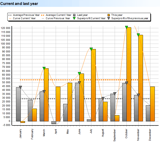
The very first graph is a visual representation of the results of the organization. Profits are symbolically represented in gold. And last year's indicators are, as usual, gray. The dotted lines are the average monthly profit. The maximum values, called " superprofit ", are also noted.
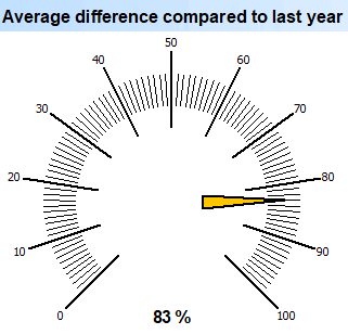
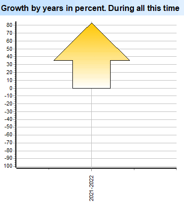
The following analytics is displayed by a modern tool in the form of a sensor, on which we abstract from the amounts and look at the change in performance compared to the previous year as a percentage.
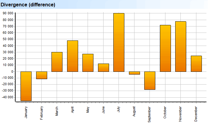
For each year, the " divergence " is calculated, which is also the "difference". Not only profit growth is shown, but also a decline in certain months of the company's work.
Next we see " seasonal fluctuations " in earnings. Values in gray are for the previous year. If they are visible, then this year a certain month turned out to be less profitable.
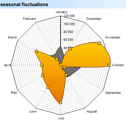
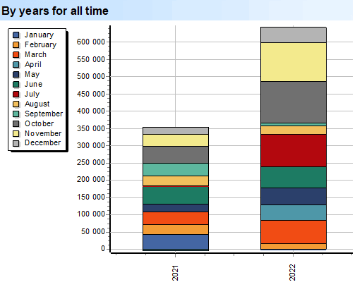
Shown every year broken down by month. If in certain months the profit turns out to be much higher or, conversely, your business functions smoothly and stably, you will see it on this information view.
It is not always convenient to operate with large amounts, therefore, professional managers perceive the increase in profit for each couple of years better as a percentage.
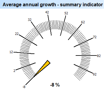
Also important in economics is the term " aggregate indicator ". This is not just an increase in profit relative to the previous year, but an average increase in profit relative to the entire life of the company.
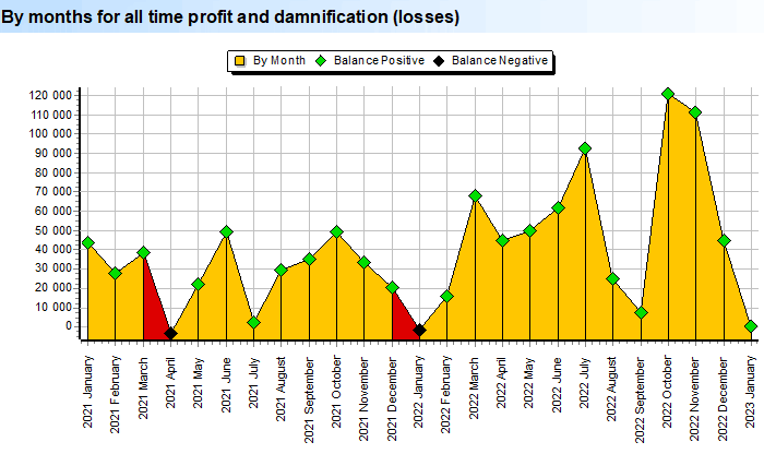
The following graph shows the analysis in exactly the same way for all time, this is how the dynamics of the organization's development can be better traced. In the context of each month, we see how much the company's profit was when the balance was positive. Or, instead of profit, we got " damnification ", that is, "losses".
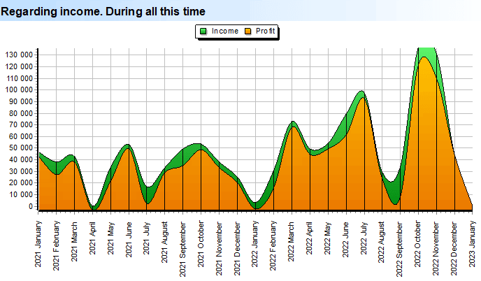
Another chart showing the size of the profit received in relation to the company's income also plays an important role in the work of an experienced economist.
Profit is what remains of income after all expenses. The more money left as profit, the better, of course. This analytics will show whether you spend everything you earn or, on the contrary, most of it remains.
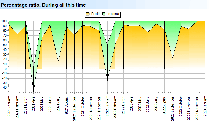
Further, in the way already familiar to us, do not forget to look at the information as a percentage. Expenses can grow with income, so it is also important to see in percentage how much of the income remains in the form of profit.
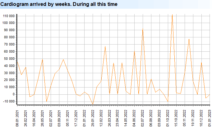
For a more thorough analysis, it is possible to see the formation of profit for small time periods - weeks. This graph is called " cardiogram profit ".
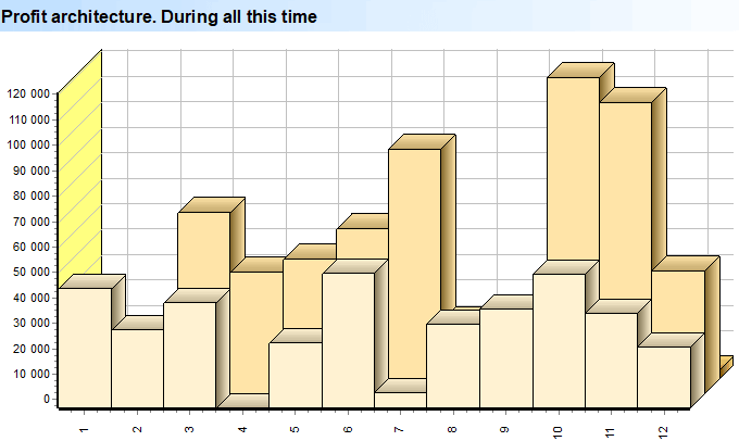
And the analysis of the received revenue is completed with a complex spatial analysis, which is called " profit architecture ". It is this representation that will show how the profit was built for each month and year of the organization's work, where each year will be a separate layer that goes deeper.
See below for other helpful topics:
![]()
Universal Accounting System
2010 - 2026
 Download the program with interactive training