![]() USU
››
Programs for business automation
››
Program for the shop
››
Instructions for the program for the store
››
USU
››
Programs for business automation
››
Program for the shop
››
Instructions for the program for the store
››
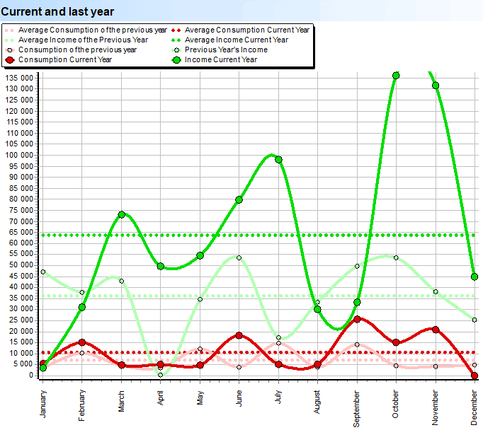
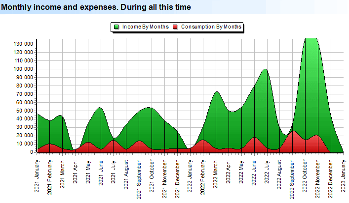
In the ' USU ' program, the analysis of income and expenses is performed using a special report. Top notch report "Income and expenses" is devoted to the most important data for assessing the state of any business - the statistics of your cash flows.
Analytics visually presents you the income and expenses of the organization. The green line shows the dynamics of changes in your income during the year. Below are the names of the months. On the left is income. The red line shows your expenses. Due to the fact that they are simultaneously presented on the same plane with income, you have an excellent opportunity to compare them visually. The dimmer lines are last year's income and expenses. You will have a clear idea of how well your company has developed over the course of a whole year, or, on the contrary, it has “marked time”.
The dotted lines are the average income and the average expense. From month to month, the turnover undoubtedly changes, so you always need to see the average figures. Dashed, dull lines are averages for last year.
This analytics will automatically calculate the difference between the average income and expenses compared to the previous year, and immediately as a percentage. Advanced tools in the form of sensors will show the increase in both income - this is a sensor with a green arrow, and consumption - a sensor with a red arrow.
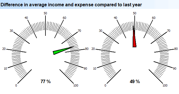
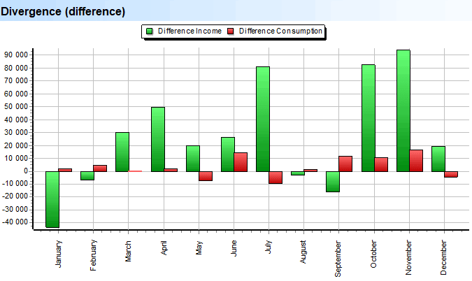
The report shows the difference both in the income of the enterprise and in its expenses. You will be able to assess for each month how much more profitable or costly it has become for you compared to the previous year. You will also see at what time of the year the increase was most pronounced.
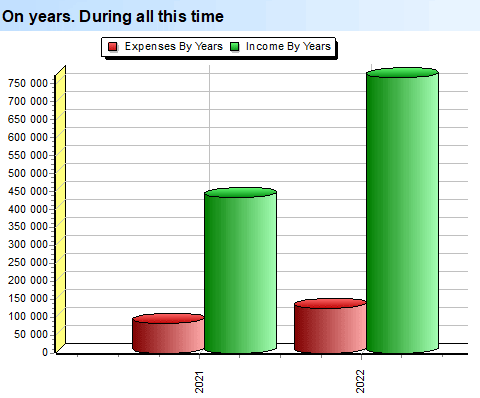
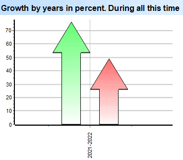
This is a long-term calculation that shows how your income and expenses change over the years over the entire period of your work. At the same time, the names of the months, but of the year, are no longer on the “X” scale.
The report will help to abstract from the exact values and look at the analytics as a percentage. For each couple of years, the increase in income and expenses will be shown exactly as a percentage.
These sensors visualize such a thing as "summary indicators". This difference is no longer compared to last year, but the average increase in income and expenses, taking into account all the years of your work.
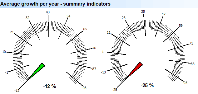
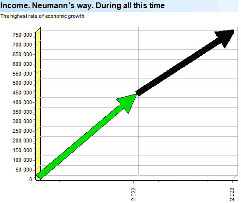
" Neyman's way " is the period with the highest rate of economic growth of the organization. Only accurate statistics will help make the right management decisions, based on what stage the business is currently in: “on the rise”, “on the decline”, or whether it is “steady and stable” to various external factors.
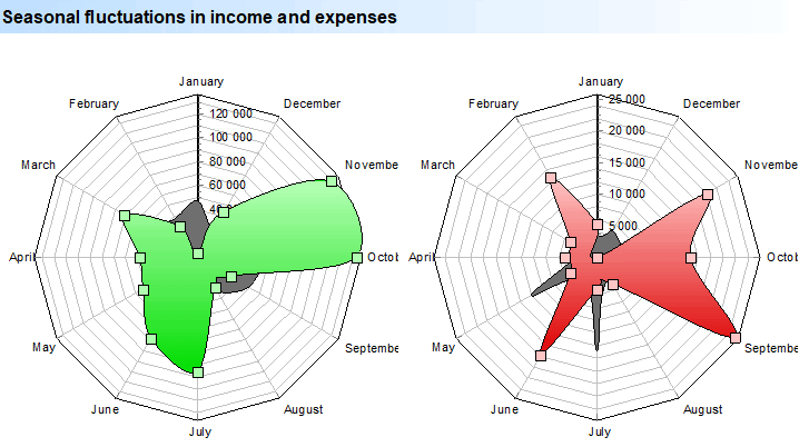
The following analytics will help to find a possible seasonal dependence. The report will show your dependence on certain months or seasons. This is important to consider when running a company. For example: to use more employees during the peak load, which will help not to lose income. It is also important not to “feed” extra staff during the calm period. Seasonal fluctuations are shown with a unique tool that allows you to see a smooth transition from one month of the year to another. Green color - income change. Red color - expenses. Note that this is the current year. And in the background, the data of the last year is displayed in gray. This also allows you to see changes in seasonal fluctuations with a difference of a whole year. Moreover, every year you can see your work broken down by months. This will give you an even better idea of whether certain months of work “feed” the year or whether income is distributed evenly.
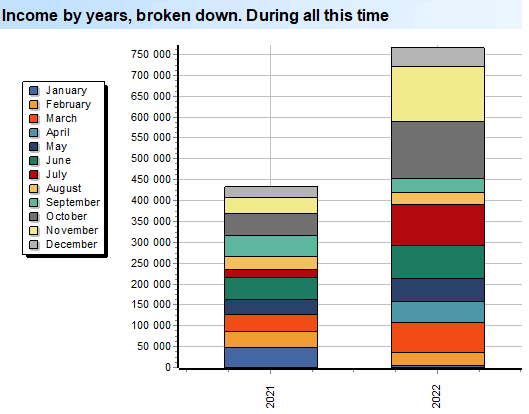
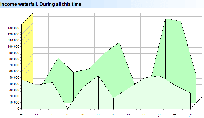
The following analytics is a visual representation of income and expenses broken down by months for the entire period of the company's operation. Here you can see the stages of growth, decline and stable unchanged stages. It is also easy to identify dangerous moments when the amount of expenses exceeds income.
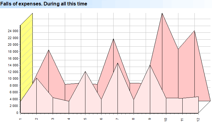
The report is similar to the previous one, only it shows your expenses.
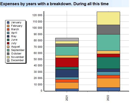
This analytics will easily identify dangerous moments when the amount of expenses exceeds income.
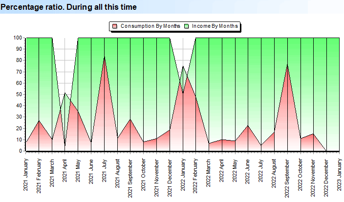
This is an even more advanced representation - ignoring amounts, just percentages. This type is very useful when both revenues and expenses increase with the development of the company. At the same time, it is important to always understand what part of the income is the expense.
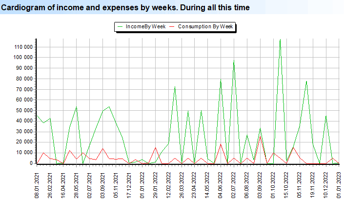
The report is used for a more thorough analysis not in terms of months, but in terms of weeks.
This is a spatial analysis with month numbers on the x-axis, spending amounts on the y-axis, and each year of your organization's operation in depth on the z-axis.
The report is similar to the previous one, only it already shows your income.
See below for other helpful topics:
![]()
Universal Accounting System
2010 - 2026
 Download the program with interactive training