![]() These features are available only in the Standard and Professional program configurations.
These features are available only in the Standard and Professional program configurations.
![]() Here we have learned
Here we have learned ![]() change the font for conditional formatting. And previously changed
change the font for conditional formatting. And previously changed ![]() cell background to highlight the most paying customers.
cell background to highlight the most paying customers.

Now let's try to use a chart to visualize values in a table that are different. To do this, in the module "Patients" for column "Total spent" instead of changing the color of the cell, let's try to embed the whole chart. To do this, we go to the command we already know "Conditional Formatting" .
![]() Please read why you will not be able to read the instructions in parallel and work in the window that appears.
Please read why you will not be able to read the instructions in parallel and work in the window that appears.
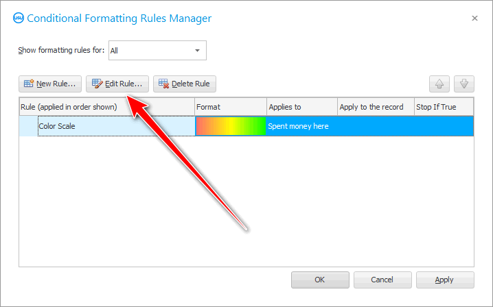
Highlight the ' Color scale ' rule and click on the ' Edit ' button.

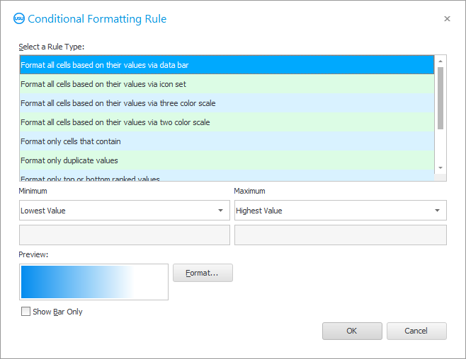
Select the special effect called ' Format all cells based on their values via data panel '.

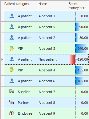
When you apply this special effect, a whole chart will appear in the selected column, which will show how much each client has left money in your clinic more than other patients.

The longer the chart bar, the more important the client is for the clinic.
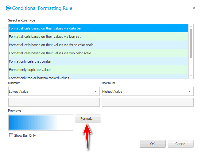
It is possible to change the chart format.

Not only can you change the color of the chart, but you can also assign a separate color for negative values.

In our case, those patients to whom the clinic returned more money than they took as payment for services will be highlighted in a different color. For example, this may be when the amount paid for damages is greater than the cost of the service itself.


![]() Read about
Read about ![]() Rank values .
Rank values .
See below for other helpful topics:
![]()
Universal Accounting System
2010 - 2025