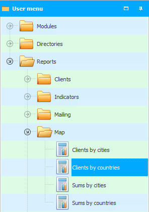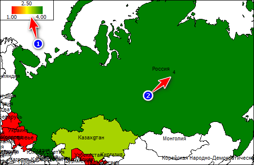
If you generate a report "Clients by country" , you will see on the map which countries have more customers.

In the upper left corner of the report there is a ' legend ' that displays the minimum and maximum number of clients. And also shows the color that corresponds to each number of customers. It is in this color that the country is painted over on the map. The greener the color, the better, because there are more customers from such a country. If there is no client from any country, it remains white.
A number is written next to the name of the country - this is the number of clients that were added to the program during the period for which the report is generated .
Geographic reports that are built on a map have a great advantage over simple tabular reports. On the map, you can analyze a country with poor quantitative indicators by its area, by neighboring countries, by distance from your country, and by other factors that may affect your business.
See below for other helpful topics:
![]()
Universal Accounting System
2010 - 2024