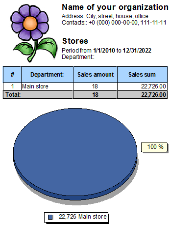
In a special report "stores" it is possible to compare the revenue of all your stores in the form of a pie chart.

Near each sector of the diagram, the percentage of revenue that each of your divisions brings to the common piggy bank is calculated.

In addition to financial data, also analyze the number of sales made.
![]() The ratio of income you earn with each store may change over time .
The ratio of income you earn with each store may change over time .
See below for other helpful topics:
![]()
Universal Accounting System
2010 - 2024